Building the SimpliSafe brand
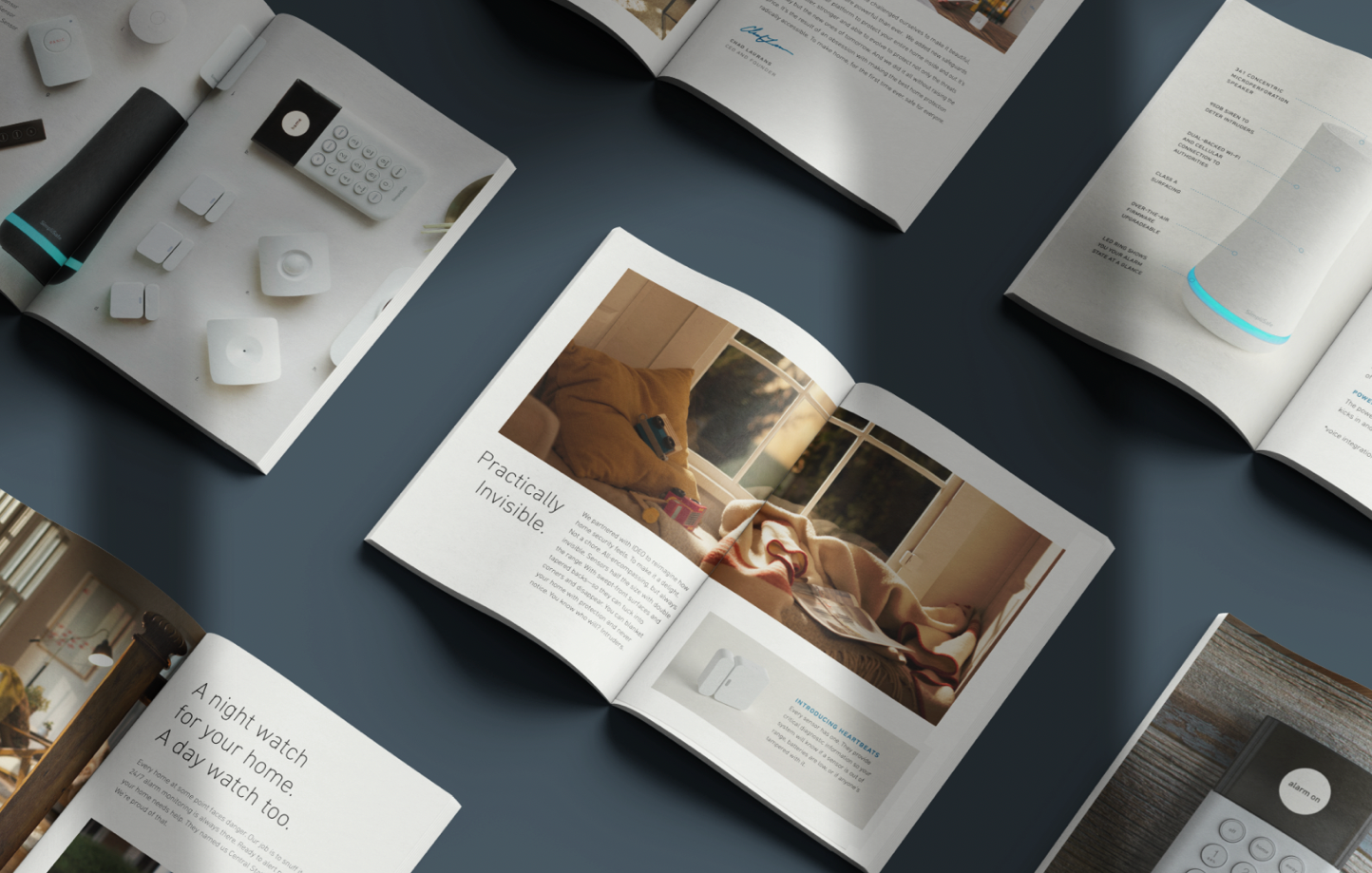
My first 10 years at SimpliSafe were focused on positioning us as a disruptor in the home security market. Our visual identity was meant to contrast with the industry giant, ADT. So where ADT was cold and generic, SimpliSafe was warm and human. I wanted to convey that Home security can be just as beautiful as any other piece of tech, and you don’t have to settle for less.


A necessary rebrand
By 2022, the home security marketplace was crowded and SimpliSafe was no longer a disruptor. Our competitors all relied on a similar visual language and we were getting lost in a sea of blue.
In response I initiated a rebranding effort and tasked Pentagram with redesigning our logo and brand palette. The new visual identity keeps one foot in the security category with a trusted dark blue, but utilizes a bright safety yellow to help us stand out. Moreover, the simple palette is easy to keep consistent in all mediums which resulted in a boost to our brand awareness and a strengthened market presence.


See more of my SimpliSafe work in UX/Product Design, Art Direction, and Packaging.